5 Steps to Take When Your Landing Page Isn't Delivering
December 3, 2018

In B2B marketing, there are many ways to optimize your online content to attract the right people to your business. Today we're taking a dive into one of the quickest ways to make a direct and positive impact on converting visitors into leads: optimizing your landing pages.
 Getting relevant traffic to your website, blog, and landing pages is only half the battle.
You may be using paid traffic, social media, or search engine optimization to promote your services and products, but if your visitors are not converting into digital leads, you are wasting a lot of time and resources.
A great ad may not have great results if the landing page it is driving paid traffic to isn't optimized for your visitors.
5 Ways to Optimize Your B2B Marketing Landing Pages
When we at TSL Marketing work with our clients, we take a look at the whole picture.
Not only do we want the right ads pointed toward the right audience, but we also want the landing pages that are receiving traffic to be fully optimized for that traffic.
When we begin working with a client, we take a deep dive into how their website is performing.
Here are five of the recommendations we usually give to ― or, more typically, implement for ― our clients.
1. Have Consistency Between Your Ad or Meta Description and Your Landing Page
Nothing is more annoying to website visitors than when they land on an irrelevant page. It wastes their time and makes your business look unprofessional and disorganized.
Take a look at how your landing page is showing up in search or on social media. Does the text accurately describe what your landing page is about?
TSL Tip: To see how your landing page shows up in Google, go to www.Google.com and enter the following: site:[Landing page URL]. Example: site:www.tslmarketing.com/work-with-us
Matching Your Ad to Your Landing Page
If you're using ads to drive traffic to your landing page, you need to make sure the ad is relevant and consistent with the landing page you're trying to send visitors to.
For example, if your ad is advertising a free webinar on a particular subject but your landing page is promoting a free eBook, you've just lost any kind of impact your ad could have had.
Be sure to use similar content, imagery, and terminology on both your ad and your landing page.
You may discover that you need multiple landing pages for different ads. The more closely your ad lines up with your landing page, the better your landing page will perform.
Examine Your Meta Descriptions
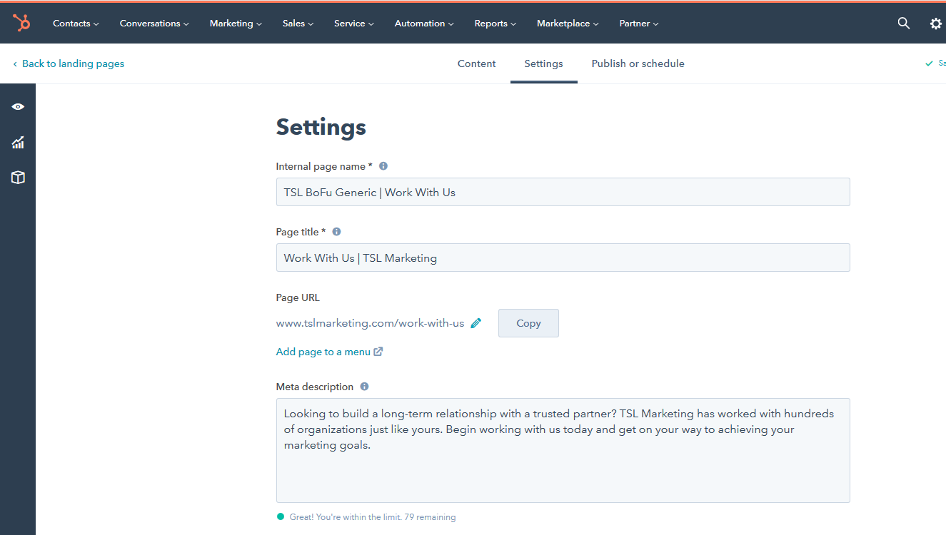
A meta description is the text that shows up on the Google search results page or on social media when your web page is shared ― in other words, the "preview text."
Leaving the meta description blank or inaccurate can also cause visitors to be confused if they click on the link to your landing page and find information irrelevant to what they thought they were clicking on.
In HubSpot, you can edit your meta description in the "Settings" tab of your web page or landing page builder.

2. Reduce Form Fields
Another common mistake that we see clients make is using a form that is too long for the content they are sharing.
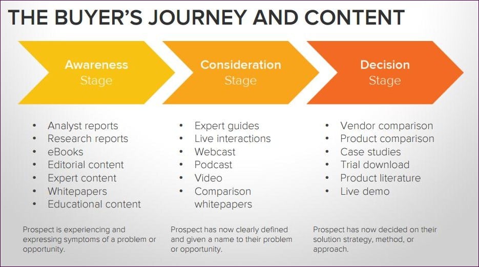
At TSL Marketing, we recommend that you take a look at where your content stands in the buyer's journey. If the offer is an introductory piece about a certain challenge and is at the top of the buyer's journey, we recommend a short form with only one or two form fields.
The further down an offer is in the buyer's journey, the more personal information you can ask for.
Below is an image from HubSpot that shows which types of offers you should be using for each stage of the buyer's journey.

Consider This Example
A landing page that only offers an introductory eBook but asks for name, email, phone, company name, job title, and more will scare off a potential lead. Someone brand-new to your company will not feel comfortable sharing this kind of in-depth information.
On the other hand, someone who has had multiple points of interactions with your company online and is further down the buyer's journey will feel much more comfortable sharing personal information.
3. Clearly Identify What the Visitor Will Gain by Submitting the Form
The better you can connect with your visitors' pain points, the easier it will be to convince them that you've got the answers they're looking for in your offer.
Your landing page copy should quickly identify the visitor's pain points and explain what the visitor will gain out of accessing this content.
Some common B2B landing page copy mistakes we see are:
- Using copy that only explains the benefits of the solution
- Using copy that only talks about the company that is giving away the offer
- Not identifying a clear incentive for filling out the form
- Not explaining who would most benefit from the offer
- Not mentioning prospects' pain points
4. Use Minimal Copy (and Write for the Web)
Studies show that on average, you have about 3 seconds to make an impression on your landing page visitor.
Your visitors are busy. They don't have time to wade through an ocean of text to determine whether you:
- Are trustworthy
- Understand their challenges
- Have a valuable offer that's worth their time to consume
Your landing page copy should use sentences that are short and to the point. Use bullet points and proper spacing to make the content easier to absorb.
Oftentimes, we see clients using big blocks of text in order to share as much about their company and their offer as possible. But this is a mistake, and it reduces your conversion rate.
Web users are very impatient and are quick to hit the back button if your landing page isn't clear. This could be detrimental to your ad budget.
Too much copy and too many offers can distract your visitor. Your landing page is there to proper conversions. Consider simple copy and do your best to eliminate landing page distractions.
5. Make Your Landing Page Load Faster
With only 3 seconds to make an impression, your landing page should load extremely quickly. Anything that takes longer than 3 seconds to load is losing a large portion of traffic to impatience.
You can test your web page's load speed by using Google's PageSpeed Insights tool or the Pingdom Website Speed Test.
Slow loading time can be an invisible conversion-rate killer and is not something to be ignored.
Continually testing and reviewing your webpages is an important part of digital marketing. At TSL, we utilize agile marketing practices to learn from and improve our efforts. This same concept should be applied to your landing pages to consistently improve their performance.
Learn more about our agile marketing process with this infographic.
Comments