6 B2B MSP Website Mistakes to Avoid (and Fix)

March 8, 2023
Managing a B2B MSP website is no easy task. Your website needs to represent your brand, address IT challenges and concerns, build trust in your audience, be effective at lead generation, and stand out amongst the competition.

You may think that to achieve all of this, your B2B Tech website needs to get everything right. We are going to let you in on a secret: your website doesn’t need to be perfect to be effective. What it does need, however, is to be successful in a few key areas as a starting point.
In this post, we will cover 6 key areas that B2B IT websites commonly get wrong – and how to start the process of making things right.
Why Should I Care About My MSP Website?
There are many benefits to having or investing in a B2B Website that is functional, informative, optimized for performance, and easy to use.
Qualified traffic to MSP websites, such as Business & IT Leaders (CEOs, IT Directors), and Office Managers, are coming for many of the same reasons, regardless of what industry or vertical they represent. Some of their pain points include:
- Outdated, insufficient, or costly technology
- Victims of a cyberattack, data breach, or natural disaster
- Changes to regulations & compliance requirements
- Resource & time management
- Budget & expense limitations
Once a potential customer is on your site, you want to keep them there by addressing their pain points, letting them know they are in the right place, and by building trust within the first few seconds of their visit.
The 6 things that many B2B MSP Websites get wrong can create a negative user experience and cause frustration. Getting these things right, however, can quickly build trust in your brand and give qualified visitors reasons to stay on your website to continue their buyer’s journey.
6 Steps to fixing your B2B Technology Website
Here are 6 priority areas to focus on if you have time and resources to invest into your MSP B2B Website.
1. Define What You Do
You have less than 10 8 seconds to communicate what your company does if you have any hope of a visitor staying to learn more.
Per a 2021 HubSpot article, our attention spans are shrinking, so it’s more critical than ever before that your MSP Website quickly and clearly communicates the following:
- Who you are: Your logo covers this (hopefully).
- What you do: Be specific! What do you want to be known for above all else? Include some strategic keywords here.
- Who you do it for: If you cater to a local geo, say it loud and proud!
- Why you are the best: Do you have the best team in the biz? Is your customer sat score 99.99%? Do you have niche expertise? State it quickly and clearly.
We know that’s a big ask to cover in 8 seconds and 70 characters, but you can do it. Work it, rework it, cut it in half, and then cut it in half again. A tool like Character Counter can help you stay on track through iterations of your message.
Viewing some examples of websites that are doing a great job defining what they do can be helpful. Here’s a snapshot of one of our customers that is doing a great job getting their value prop across quickly and effectively:
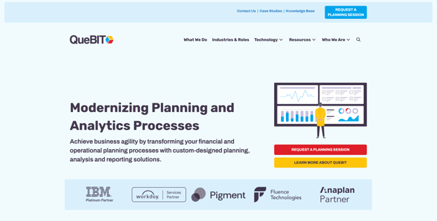
Remember, your MSP Website H1 isn’t carved in stone; you can rework it any time you want! Just be sure you check with your SEO team before making any drastic changes.
2. Build Trust Quickly
Qualified visitors coming to your website need to know that you are a company that they can trust doing business with. It’s critical that visitors see trust signals within the first few seconds of landing on your website, as this will begin building credibility. Some ways to incorporate trust signals on your website include:
- Testimonials: Quotes from satisfied customers that show how much they loved working with your company. Including the customer’s name, title, company name, and company logo are ideal. If you are only able to use anonymous quotes, that’s ok too – something is better than nothing.
- Success Stories: One step up from the testimonial is a full-fledged success story. Organize your success stories by industry, persona, technology, or any other way that will help users sort through and find an example where you solved a problem that they can relate to.
- Customer Logos: Having customer logos on your site, even without attached testimonials, will show visitors that you are a trusted company with a solid reputation.
- Ratings and Reviews: Sharing positive Google reviews, customer satisfaction ratings, or other reviews and ratings is a quick way to build trust. 5-star reviews speak for themselves.
- Partner Logos / Badges / Emblems: Showcasing trusted vendors on your website can help build credibility and is something that most (if not all) MSPs can easily share.
- Certificates, Awards, Accreditations: Promoting the expertise of your team is key, and sharing these on your site can help to build trust in the people who are hands-on and doing the work.
- UX Content: Content that solves for user intent and is clearly written for the intended audience. Consider helpful additions to your website such as FAQ modules, top-level pages that give an overview of services and solutions (ex. Cybersecurity), and sub-category/child pages that dig deeper into offerings (ex. Dark Web Monitoring).
Place trust signals in prominent locations; don’t bury them under other less important content on your site. It’s important that website visitors can find this trust-building content quickly and easily, without even trying.
Here’s an example of one of our customers that is working to build trust quickly by offering success stories for the visitor to read right on the home page banner:
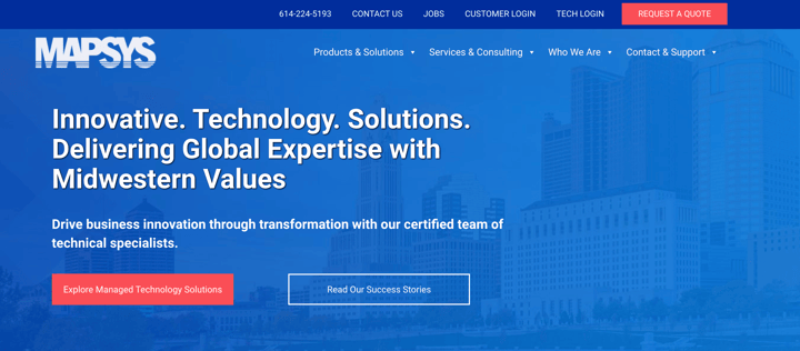
It’s also important to remember that you should start with what you have and build your way up. If you only have one item on the list above, then work with that and create a plan to slowly add other trust elements to your site over time.
3. Create a Primary CTA
Every MSP Website should have a Primary CTA that can be used sitewide to allow site visitors to convert when they are ready to take the next step. Our team refers to this as the Primary Website Offer.
Pro tip: Contact Us does not count as a Primary CTA.
After a Primary CTA is established and being used sitewide, additional CTAs can be created to give website users an even more targeted and strategic experience on your MSP Website.
Here are a few steps to follow to help you create a Primary CTA that will speak to your target audience and deliver value:
Selecting an Offer
- Choose a CTA that aligns with your sales process and gives qualified website visitors a meaningful way to take the next step in their buyer's journey.
- 3 examples of Primary CTA / Primary Offers that we see have success on MSP websites include: Request a Quote, Request a Proposal, Schedule a Demo
Building an Offer
- Build the Offer: Create a dedicated landing page that will present your Primary CTA / Offer in full detail.
- What the offer is: Be sure it’s clear what action you want qualified visitors to take.
- Who it’s for: Build some qualifiers into your body copy.
- What to expect: Bullet out what will happen when users fill out the form.
- What happens next: Give an idea as to what the next steps will be.
- Establish Trust: Consider including an ‘about us’ statement, testimonial, partner emblems, ratings, etc.
Optimizing Your Offer
- Navigation: Include the primary navigation as part of the page to give visitors the ability to continue their research of your brand as needed.
- Thank You Page: Set up a Thank You page to provide a seamless user experience, and so that you have a way to set up tracking.
- Buttons: Add CTAs and buttons that complete the statement ‘I want to’ to each page on your MSP Website to ensure qualified visitors can easily convert when ready.


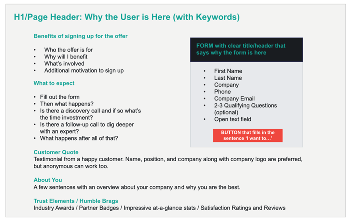
Below is a formula that you can use to create your MSP Primary Offer page. Want to see a successful Offer Page in action? Check out one of our live customer pages here.
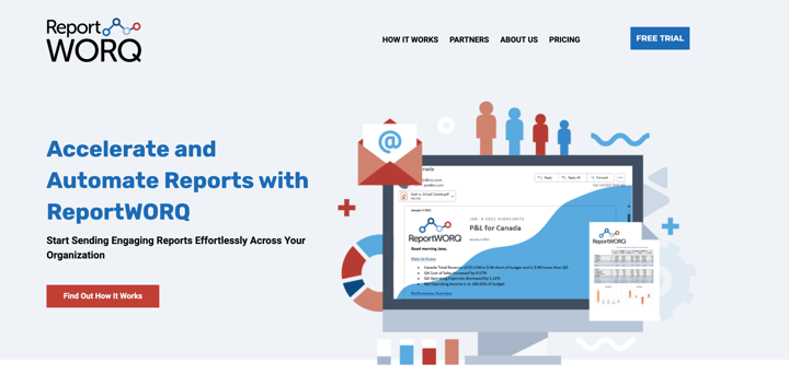
The screenshot below provides an example of one of our customers’ websites that is using Free Trial as their primary CTA.
4. Make It Easy to Contact You
When qualified visitors are on your MSP Website, it’s critical that we help minimize decision making, a la Don’t Make Me Think by Steve Krug.
One area where we absolutely don’t want any friction is how qualified visitors can contact your team. A few no-brainer ways to ensure you don’t miss a potential customer conversation include:
- Include Contact Us in the primary navigation – be sure it’s accessible both on desktop and mobile.
- Include your phone number in the navigation or secondary navigation bar and give it click-to-call functionality.
- The footer should also provide your click-to-call phone number along with your full address. Additional locations should also be listed if possible.
Contact Page Must-Haves
5 things every MSP Contact page should include:
- An easy-to-use, standard form
- Click-to-call phone number
- Address and Map of your headquarters
- Address and Maps of any additional locations
- Links to support, submit a ticket, email, chat, etc.
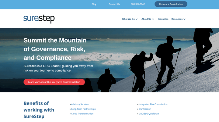
This customer website provides 3 straightforward ways for a visitor to contact them right in the navigation: Contact Us, their phone number, and Request a Consultation.
5. Use Real Photos
The most common stock photos lack personality and don’t build trust in your people or your brand. I think we all know the stereotypical generic MSP stock photo when we see it. Think posed and smiling faces or an obviously fake techy image.
Headshots of staff, photos of your office, and photos of team events go a long way toward building trust on your website and proving that you are a real company full of real people. It’s just human nature to want to know who’s behind the curtain.
If you don’t have your own company photos and can’t hire a photographer, be selective about what stock photos you decide to use. Choose photos that help to bring your messaging and your brand to life, and avoid generic-looking stock photos at all costs.
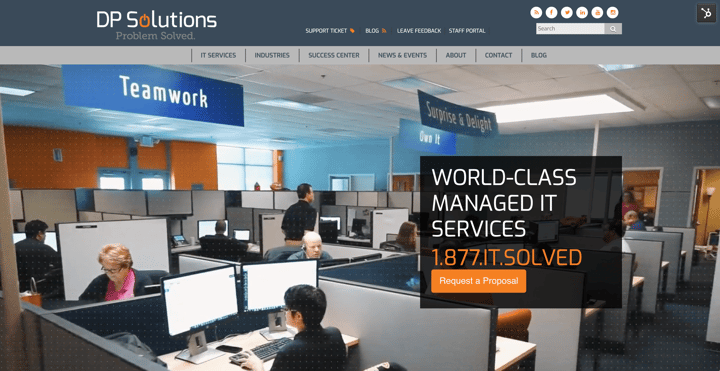
This is a perfect example of one of our customers using real photos – and even a video – on their website:
6. Visit Your Site on Desktop & Mobile
Sometimes all it takes to see how your MSP Website is doing is to just log on and check it out with your own eyes. Taking a few minutes every so often to look at your site and make sure all looks well is something quick and easy that everyone can do.
MSP Website User Experience Checklist
- Check both desktop and mobile versions of your website.
- Use your website navigation on desktop and mobile to make sure it’s functioning properly.
- Make sure your footer appears as it should.
- Take a moment to fill out your primary forms to ensure they work and are not glitchy.
- See if pages load quickly.
- Ensure that buttons appear where they should on the page.
- Note if general page spacing looks on point.
- Do a general gut check – do things look ok? Or is there something off that you think requires a second set of eyes?
Key Takeaways to Help You Build the Best MSP Website
Following these tips and cleaning up your B2B MSP Website will bring you that much closer to delivering the best possible experience for your target audience. We want qualified visitors to STAY on your site once they get there!
While accomplishing all the items listed in this article may seem daunting, it’s important to pace yourself and take things one step at a time. It’s better to make a little progress than no progress at all. Getting help from an agency partner that specializes in MSP Website growth and development can also be a huge help, especially when there doesn’t seem to be enough hours in the day.

Continually optimizing and improving your B2B MSP Website over time can help to build your brand, increase conversions, and win new customers.
If the steps outlined above sound like they’d help your MSP Website, but you don’t have the time or people to get it done, let our team of B2B Tech Website experts go to work for you.


Comments