Communicating Visual Elements for B2B Content Design
March 24, 2020

In B2B content marketing, designers are responsible for creating the mockup of a piece of content or web page before it goes into development. But there is a silent partner who helps guide the designer’s formatting decisions: the copywriter.
Using design notes and comments, a copywriter can indicate in the copy the most important parts of the page, what elements belong to each other and should appear in proximity, how important one section of the page might be in relation to other parts, and what space needs to be allocated.
For the designer, these short and sweet notes help them understand how to structure the page and where to place specific elements so that it's aesthetically pleasing and highlights the most important components for the user.
Though project managers usually inform designers of the target persona, the company’s branding and style guidelines, and other specific requirements, the copywriter takes structure into account and formats the copy for a smooth and quick transition into design.
The Copywriter's Role in Design Planning
B2B marketing designers don’t always have the time to fully read the material to uncover the most important elements on the page. Copywriters are in a better position to convey the structural vision.
If designers are presented with good design notes in copy, they can spend the full amount of time designing instead of querying for clarification or combing through resources to answer questions. Notes provided by the copywriter add to the efficiency of the design process, packaging directional guidance right there in the document.
“Design notes in copy are like a blueprint I use to build a framework for each design,” said TSL Marketing Designer Jamie Hill.
These written visual aids also help our clients envision how the final product will look while they're reviewing copy. They are able to see how graphics, logos, tables, charts, graphs, or schematics will be placed in conjunction with their marketing message. Clients are then able to make some design changes or additions before a design is even created, which ultimately accelerates the production process by reducing future design rework.
“Design notes in copy are like a blueprint I use to build a framework for each design.”
--- Jamie Hill, TSL Marketing Designer
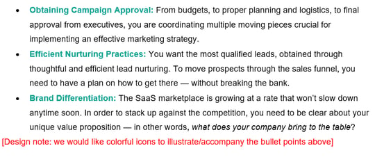
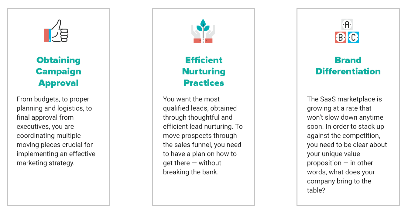
Michele Balze, TSL Marketing Copywriter, shares how she crafts the perfect design notes to aid our in-house designer in the efficient execution of our clients’ B2B marketing content. We've included before-and-after examples of transitions from copy to design, with snapshots from our own internal marketing efforts, to illustrate the process.
Structural Notes for New & Redesigned Web Pages
- H1s, H2s, and H3s (will dictate text size for each headline)
- Entry points and how they should be arranged: [Design note: Place these 3 entry points vertically across the page.]
- Behavior of entry points (static or revolving): [Design Note: Entry points will be on a slider. Create 3 designs to show each one in action.]
- Underlining to indicate text link placement (won’t be linked until development, but shows stakeholders where they’re located)
- Placeholders: [Design note: Add section for testimonial. Waiting to receive from client.]
- Call-outs/bullet points: [Design Note: Present these stats horizontally with visuals.]
TSL Example


- Testimonials & quotes from thought leaders: [Design Note: Use this quotation as a call-out. Use large, graphic typeface.]
- Graphics (the designer also creates these): [Design note: Please use the above statistics to create a main image for this infographic.]
- Calls to action (CTAs): [Design note: Button color should reflect company branding.]
TSL Example


- Logos: [Design note: Include partner logos here.]
- Badges of Trust: [Place certification logo here.]
- Sidebars for bonus information: [Design note: Place the incentive program copy in a sidebar.]
- Graphs and charts: [Design Note: This info appears in a table.]
- Section dividers (if applicable): [Design Note: Place a divider here.]
Design Direction for Optimized Site Pages
When optimizing content for an existing web page, a wireframe is typically not created. The copywriter uses direction from the project manager and the client’s wish list to revamp copy with new features and text.
Sometimes, when there are only small copy changes, these projects skip design and go right into copy replacement with the development department. Other times, when there is a major content overhaul that involves new entry points, large chunks of text replacement, or updated call-outs or sidebars, a design will be created to show clients how their wish list items will be incorporated into the current page.
“In this case,” Balze said, “my design notes in the copy will be just cues to show the designer where new copy or updated text fits into the current page layout.”
If an internal design of the current page already exists, a copywriter can make the designer’s job even easier.
“If I’m optimizing, the designer doesn’t need to completely swap out the copy to update the design,” Balze explained. “I’ll go back into the original copy, make changes, and highlight those changes in yellow so he doesn’t have to replace the entire copy — just the areas where copy is being altered.”
Notes could include:
- Updated statistics: [Design note: I have highlighted the new stats to be placed in the call-out box.]
- Copy replacement location: [Design note: This text is for the first panel with the dark blue background.]
Design Concepts for Other Marketing Content
Before writing a long-form piece of B2B marketing content, such as an eBook, the project manager and copywriter hold an intake call with the client to come up with a concept for design, including overall theme and style (e.g., strictly business professional or casual and fun).
For these longer-form projects, the copywriter will indicate in design notes the required elements (such as those listed above), the client's or stakeholder's specific design requests, and opportunities for statistic call-outs or pull-out quotes.
Other times, particularly with TSL’s own marketing content, Balze has the creative freedom to come up with an overall design concept on her own. And her ideas have proven design-successful.
“There have been a couple projects where I came up with the concept, and the designer did an amazing job in realizing that vision,” she recalled. “We did an eBook called How Great Content Dresses Your Company for Success, and I had the idea to make it look like a fashion magazine. Our designer, Jamie, did an amazing job. It was slick and polished and featured pictures of models in business attire."
"We also did an eBook called Combine the Powers of Inbound and Outbound Marketing, and I suggested that it be made to look like a Lichtenstein for a comic book feel."
“Those are just a couple of examples where our copy department collaborated with design, came up with a concept, and our designer ‘realized’ it into a beautiful finished product," Balze said.
Communication Between Copywriter & Designer
It can save a lot of time and effort if design direction is done correctly and with detail. If the designer is able to easily interpret the formatting of the page via notes in the copy document, the design process becomes more streamlined and efficient.
Design notes embedded in copy provide designers with enough context to be able to make visual decisions and interpretations. Instructions should be specific as possible without being too restrictive, as designers still need that freedom to create.
In other words, the more contextual the detail, the better.
And the designers appreciate it too.
“The copywriter’s design notes are extremely valuable because it gives me a window into how they are interpreting the design,” Hill said. “It saves me TONS of time. It also puts us on the same page during my design planning.”
Take the first step to building more remarkable B2B marketing content. Contact TSL for a digital marketing assessment today.


Comments